CASE STUDY #2
CyberGRX
Here are three initiatives I led that positively impacted my company in the past two years (all centered on data visualization).

a. Systems Map

b. Concept Car
c. Charting Library
A. Systems Map
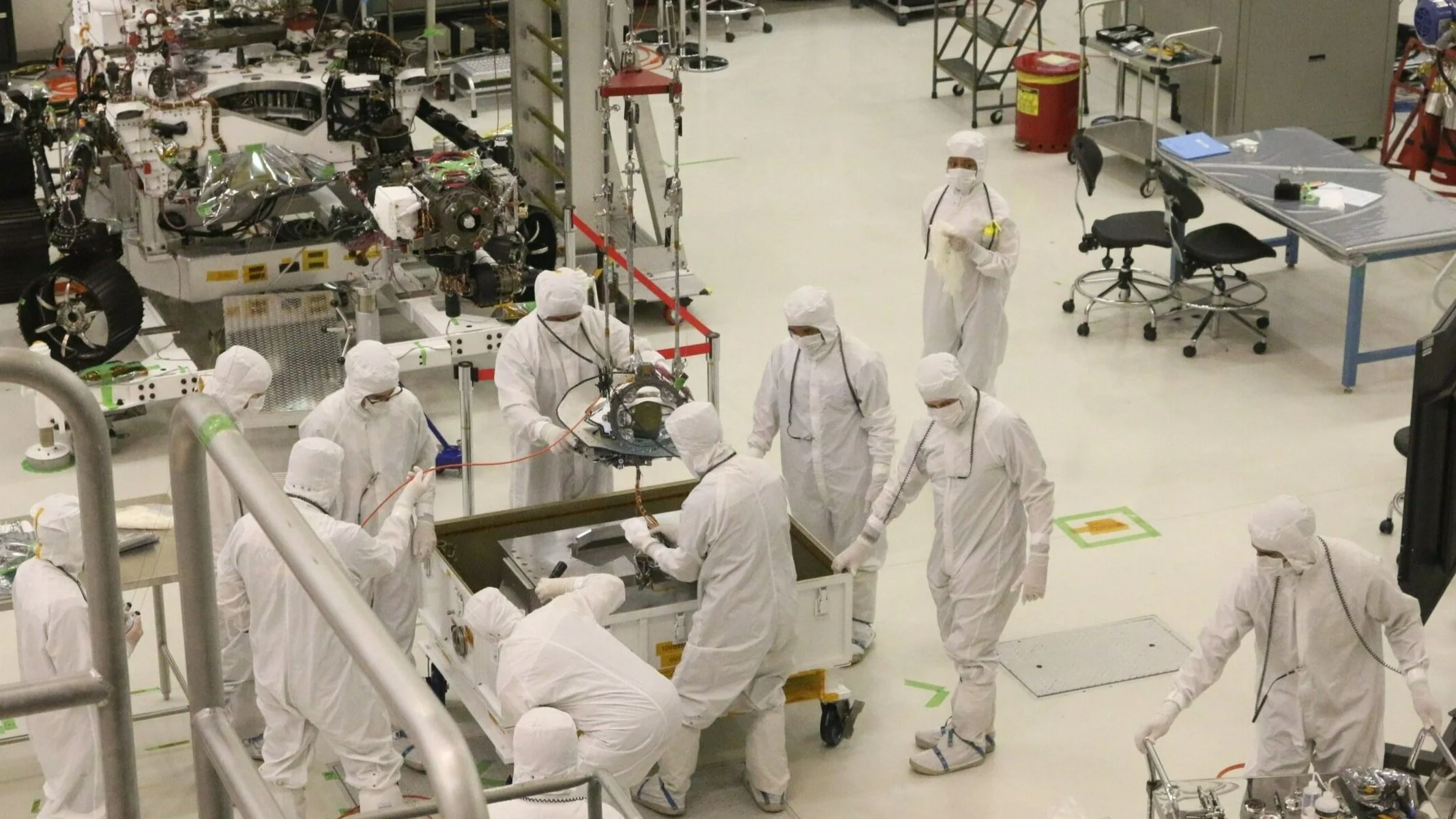
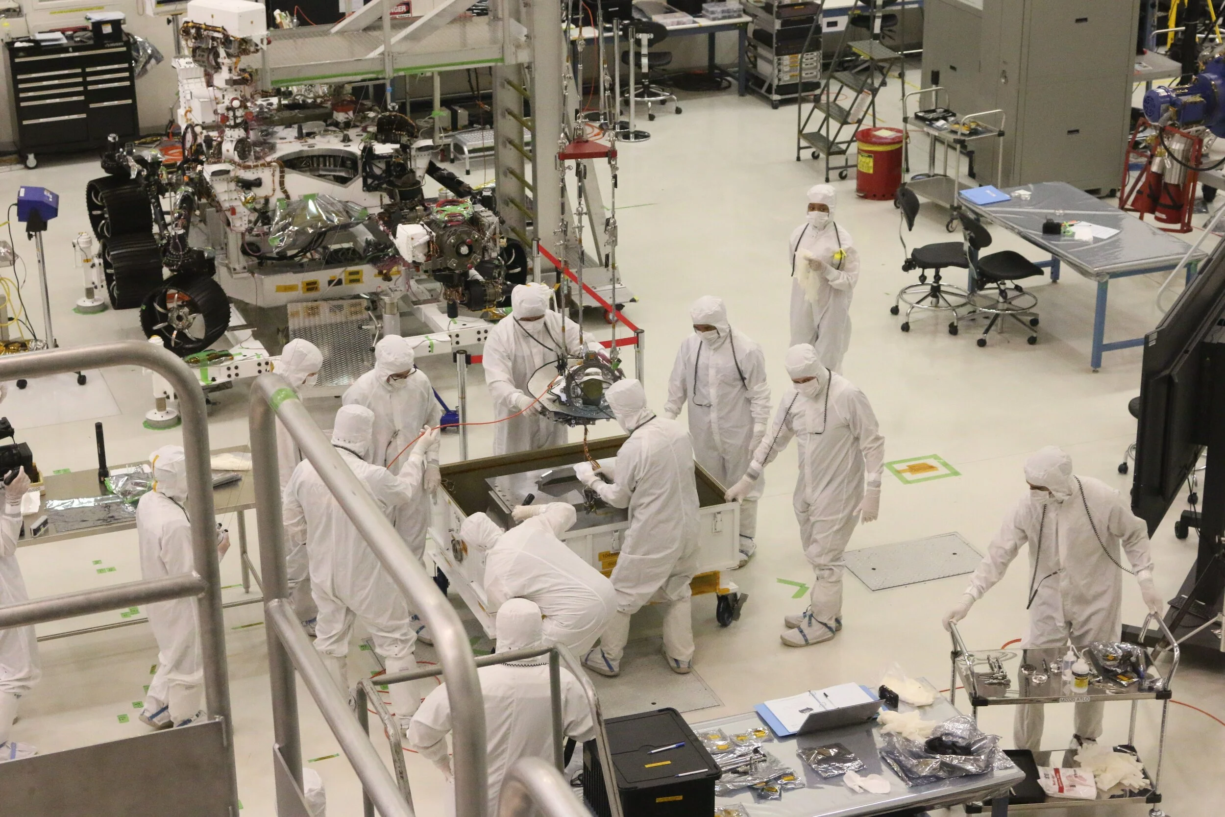
Working across four internal business units and two customer bases, my first project at CyberGRX was to map out our intricate customer lifecycle. This systems map was used by our executive team to identify critical areas of improvement.
“You do not rise to the level of your goals. You fall to the level of your systems” - James Clear
Get the data
We didn’t have any visual flows of our customer lifecycle as it lived when I entered my role. Internal interviews highlighted undocumented intricacies and personal pain points for employees.
Map it
To increase accessibility for CyberGRX employees, I used Lucidchart to map out the lifecycle. The final map displayed: core customer experiences, who internally completed an action, high-ROI improvements, communication with customers, pain points and any planned process changes.
Use it to grow
This systems map has now been used in multiple initiatives aiming to reduce time-to-delivery as well as an onboarding tool for new employees. I presented this to the E-team both in quarterly planning meetings and at an offsite focused on operations efficiency.

B. Concept CAr
This project was co-led with the UX Manager who started mid-discovery.
The product road map was being rebuilt at this time. We had cool feature ideas proposed and being sifted through….so what better way to give them structure, start ideation and get everyone excited than a concept car?
Not solutioning too soon
We knew the risk of internal stakeholders getting too attached to a hi-fidelity mock, so we purposefully use a different dark mode color scheme and different components, fonts etc. This was art instead of an asset for engineering or customer service and could not be mistaken for a solution we were actively developing.
See the future with us
This has been a useful tool to:
Get internal stakeholders to think big about platform changes
Change the narrative around how we think of ourselves as a company
Spearhead site map changes
Ideate large changes to our data visualization
C. Charting Library
We were transforming into a data company and our platform needed to reflect that. While we did have some visualizations serving us well, many were neglected and most of them had been custom coded each time. This was slowing down our development and causing attrition. Using a standardized charting library was necessary.
Happy engineers, happy Life
I started with the stakeholder owning this bottle-neck: development. To both reduce development time and create iterations we needed a library engineering could work with quickly and fluidly. We found a library that had many out-of-the-box solutions that fit our needs immediately and for the foreseeable future.
Introduce a visual
Luckily, we had a number of features coming out that benefited from data visualizations. We were able to use the library for a feature being delivered within two quarters and refine the new workflow with analytics, product and engineering. The feature has been delivered with great reception and is a competitive tool we uniquely offer in our market.